
Brand Identity Design
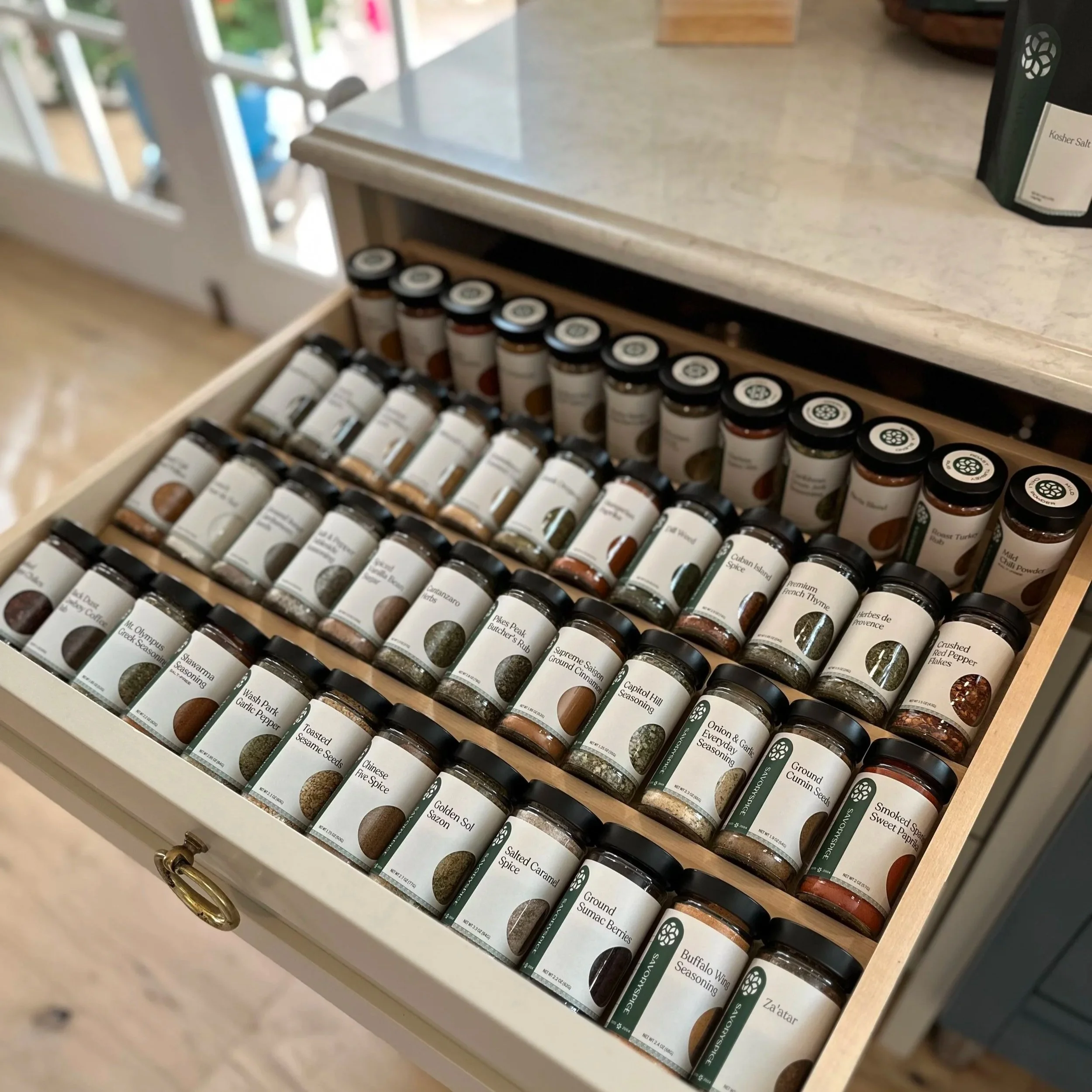
Savory Spice Shop spice jars and new website. Redesigning a jar label for the modern kitchen. Finding and organizing spices in drawers and cabinet pull-outs was a real pain point for home chefs, so we set out to fix it. With more than 400 SKUs and an in-house label system that prints on templates and is applied manually, we had to get creative.
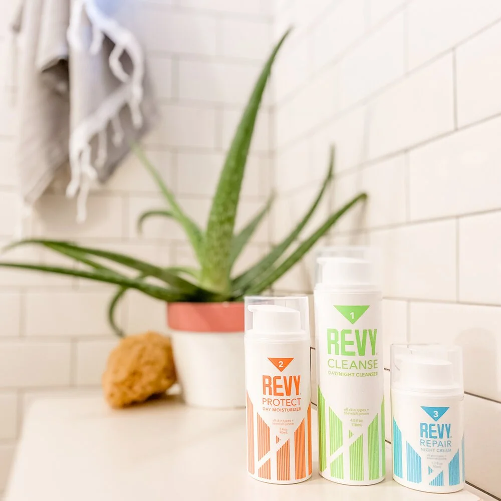
The brand identity creates a goalgetters vibe that amplifies the new REVYlutionary clean skincare routine. At the heart of REVY is a commitment to taking action and empowering others to be confident, pursue adventure and live lives fully, naturally. The design elements intentionally and thoughtfully work together to create a look + feel that celebrates the purpose-driven system and encourages living your WHY to the fullest. deliverables included :: BRANDING / PACKAGING / WEBSITE DESIGN / COPYWRITING / CREATIVE DIRECTION
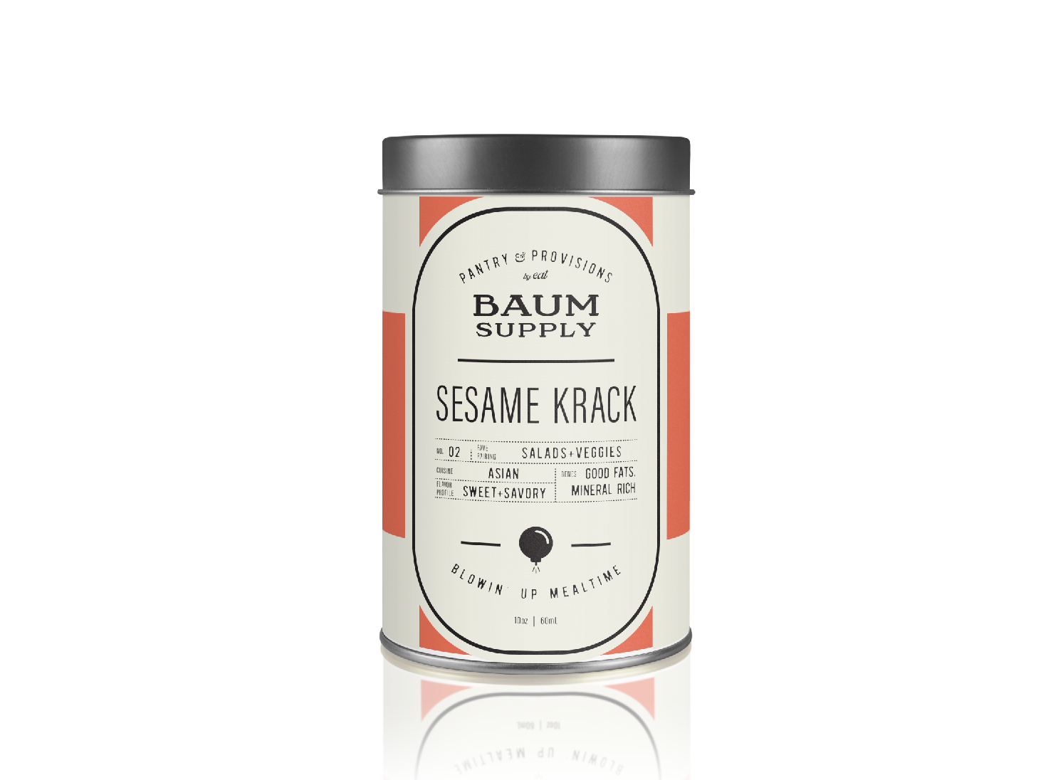
Baum Foods’ ideal audience values experiences over things. This passionate tribe is building a way of life that takes full responsibility for their own personal development. By removing the intimidation from cuisine and connecting them to where food comes from, Baum Foods will become an empowering flavor tool that is an adventurers secret weapon in the kitchen. Each yummy release will open up a new world beyond their table with each bite.

Woodward Barbers is a classic community barber shop in Erie, Colorado. The owners came to BirdDog Partners with a name that has a historical significance, rooted in the iconic Woodward Ave, Detroit. The design suite included straight razor monogram logo, classic typography with a twist, a custom poker deck, iconic storefront signage and more. Guests will come to enjoy first-class, professional grooming excellence amidst classics such as subway tile, houndstooth pattern, signature barber chairs - as well as a few modern surprises - a vinyl listening station, bronze anthropomorphs, a local artists’ mural.
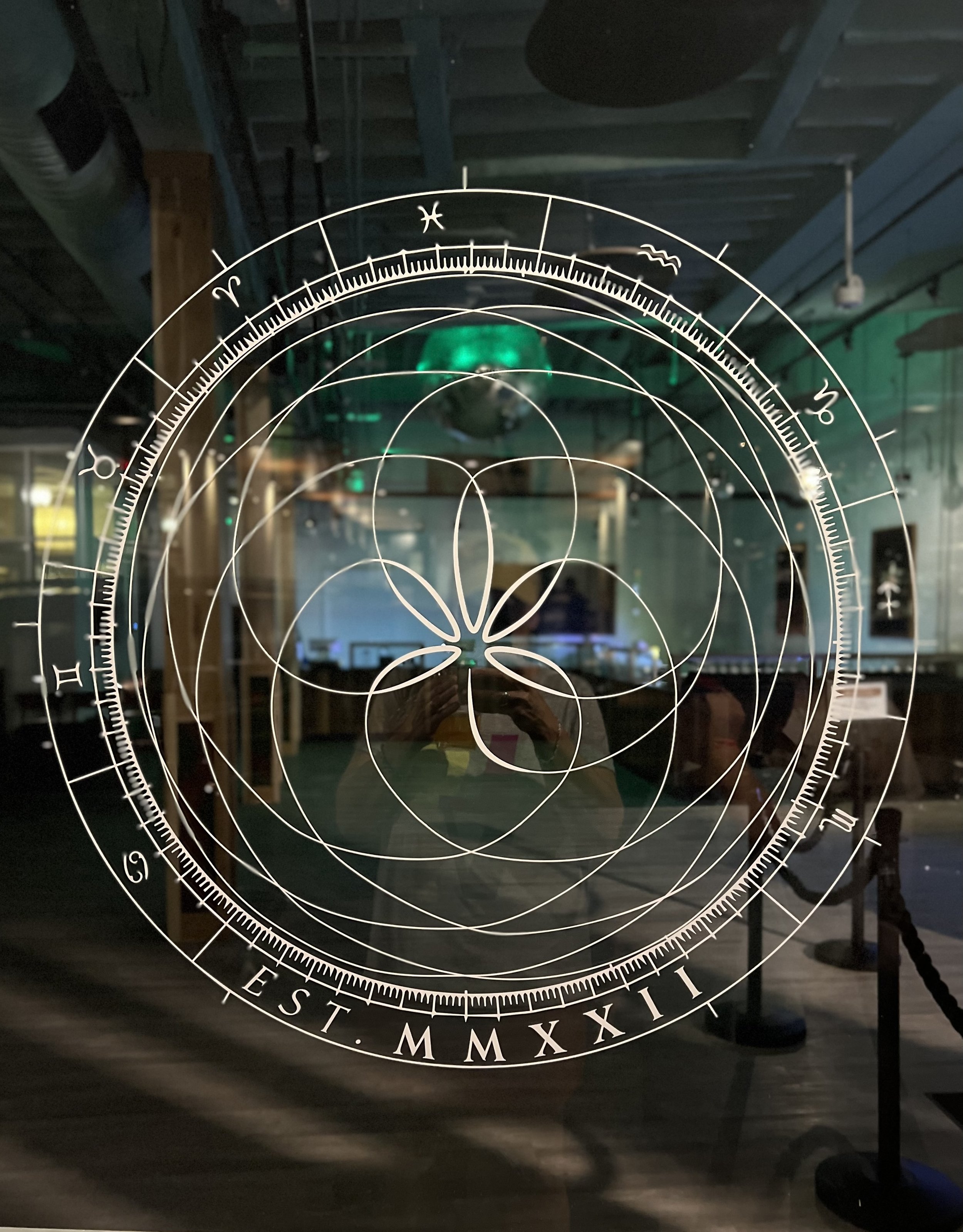
Planting the seeds of the future, with goddess relics of the past the Venus&Mars is a boutique atelier – putting a brick in the wall that breaks the current paradigm of pot shop. The Venus&Mars wordmark uses a classic Roman style typeface with a twist that instantly balances feminine and masculine. The use of ampersand was carefully chosen for its connection to the past. The mark features a shorthand V&M monogram alternate logo. The mark echoes the planetary orbits as seen from earth for centuries.

Recreation Solutions Group specializes in people, parks and protected areas and their overlapping disciplines. RSG believe in high-end simplicity, clear strategy and meticulous execution. With a well-trained eye and over 25 years of experience, RSG is able to predict relevant visitor use issues to craft impactful solutions for land managers.
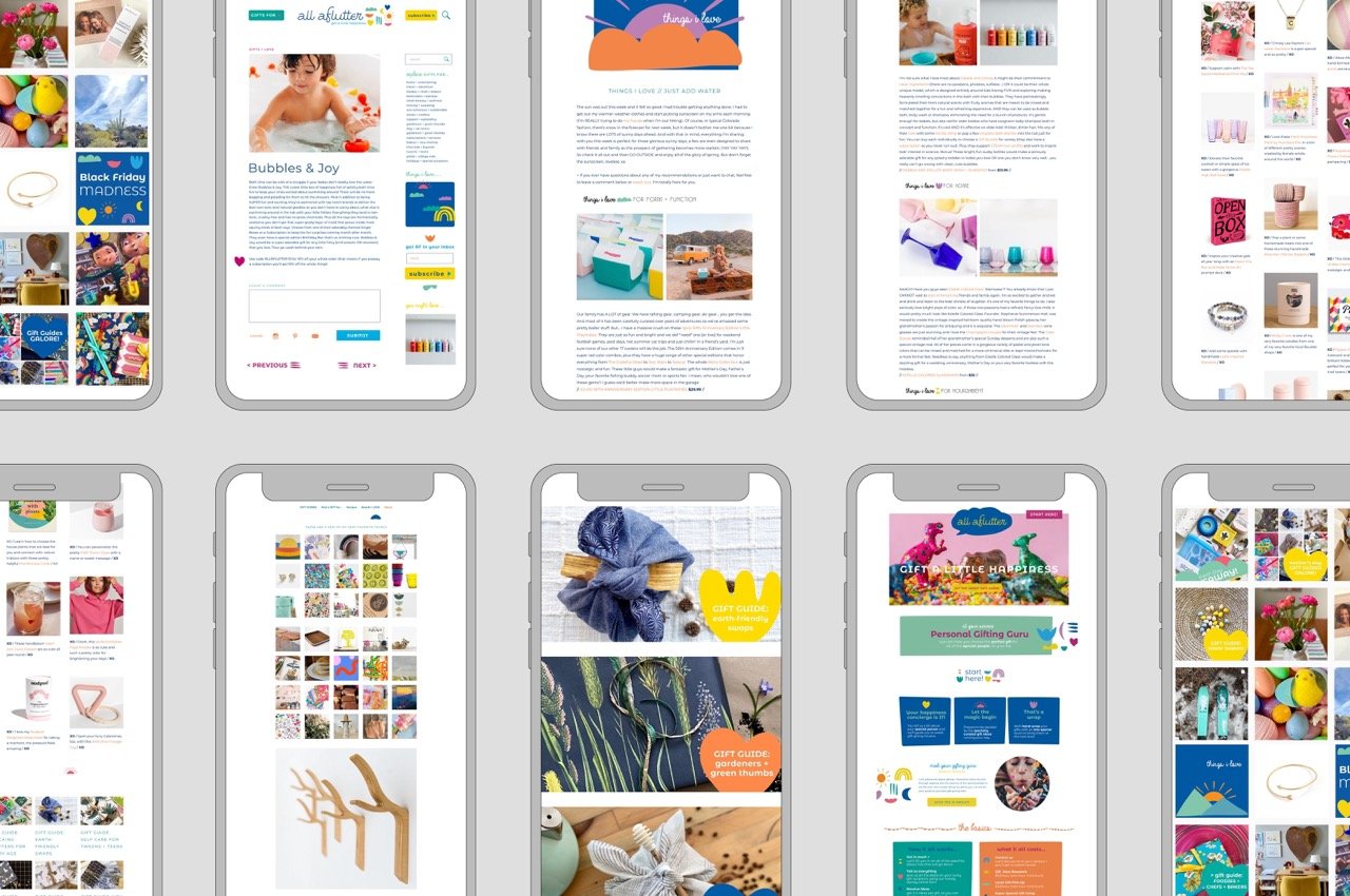
All Aflutter is a blog and social channel dedicated to giving the very best gifts to everyone on your list! Much like putting together the perfect gift, the All Aflutter logo is an assemblage of serious fun and fabulous surprises including just-serious-enough script and a slightly bubbly sans serif that begs to be filled with happiness!
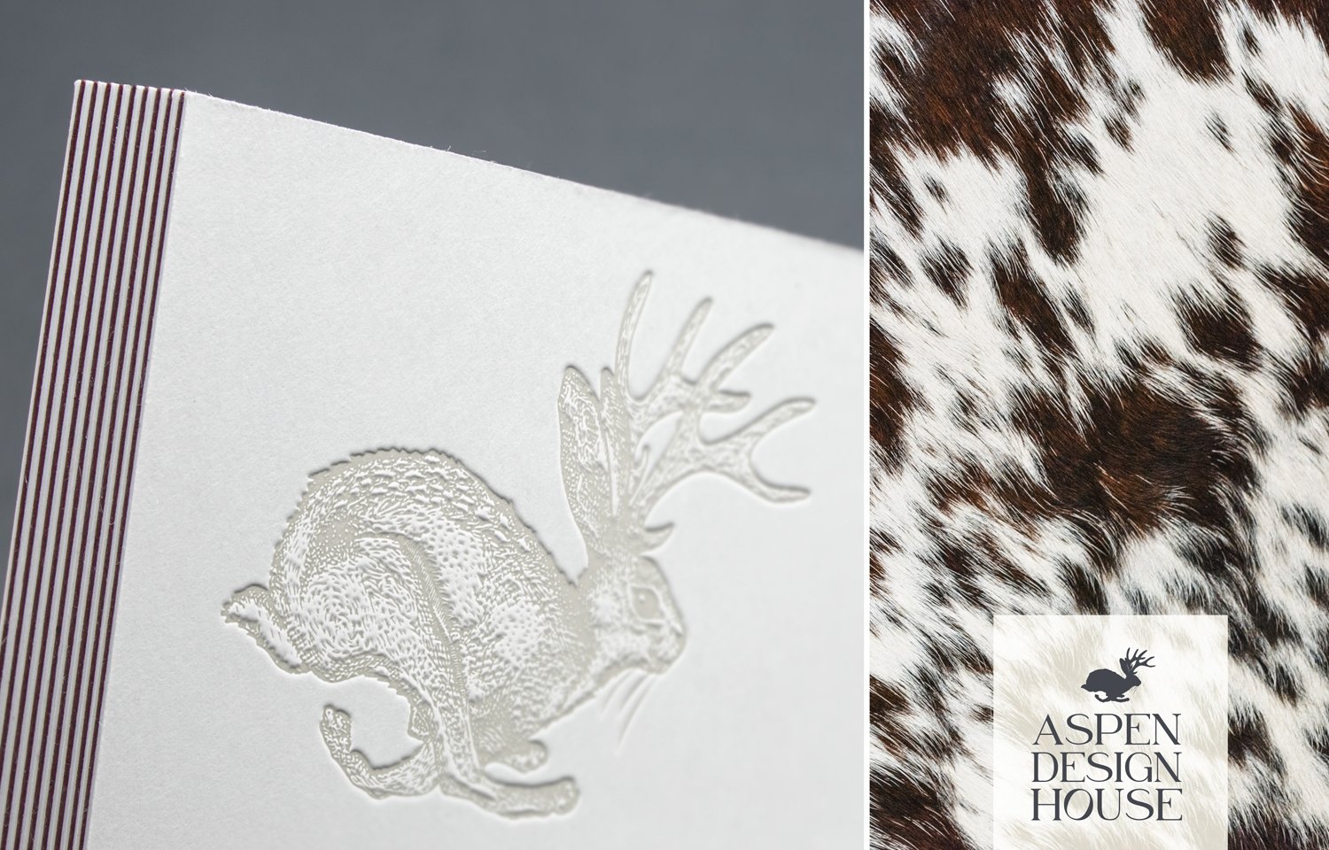
Much like putting together the elements of a home, the logo and marks are a collective o f layered texture, shape, scale and colorful detail that celebrate the fact that every client is a snowflake. Telling a story in any combination, there is a balance of both intellectual and charming bits that await you around every corner.

Rooted in whole body wellness, Kristy Vetter guides her clients to proper nutrition through health education. Always: Individualized, Long-Term and Evidence-Based. Never: Fad Diets, Mass-Market or Standardized. The logo is an amalgamation of concepts including nutrition and health, as well as symbols of nature, aspen leaves, sunshine and mountain peaks in a sophisticated, simplified emblem that will translate well across the brand.

Our homes are to be our sanctuaries. A place where we feel most connected to ourselves, relaxed and centered. We are meant to live close to nature and that is exactly why plants lift our mood and create serine environments in our homes or office. It’s self-care in the simplest and purest form.
Eat is a creative culinary company located in Aspen, Colorado that takes great pride in creating dishes that are real, rustic and harvested fresh. Chef Katie believes that healthy cuisine can be joyful, creative - and, of course, beautiful and delicious!

Branding an idea is one of the most rewarding processes. I am honored to say that the client actually cried when I presented this brand concept. A mentor had once said something to them to the effect of “If you want to kill something, we call it a weed …” Let’s flip the script on that, folks.